
Combining three bright colors in the same outfit presents a problem that most style guides avoid: readability. The articles available online detail the color wheel and list harmonious duos, but rarely address the issue of balance when it comes to three bold shades.
The challenge is not choosing three colors that “look good together” on a color chart, but distributing them on a moving body without the whole ensemble becoming noisy.
Further reading : Fashion Trends in Paris: Must-Have Styles of the Season
Visual hierarchy of a trio of bright colors: dominant, secondary, accent
The principle is borrowed from graphic design, where each composition relies on an uneven distribution of colors. Applied to fashion, it involves assigning a specific role to each of the three shades: one color occupies the majority of the silhouette, a second supports an intermediate piece, and the third appears only in touches.
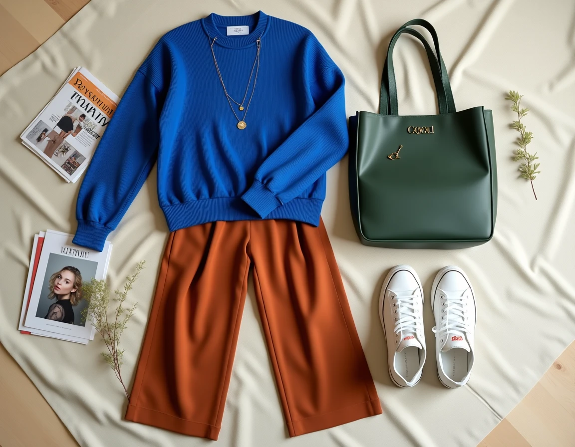
The dominant color covers about two-thirds of the outfit. It sets the overall tone. Wide trousers and a blazer in the same shade, for example, create a stable visual block. The secondary color appears on a single piece (a top, a skirt, a scarf worn as a belt). The accent color is limited to an accessory or detail: bag, shoes, earrings.
Further reading : Why adopt wooden shade frames for your garden and greenhouse?
This distribution avoids the “color block” effect where three equal masses compete for attention. The eye follows a progression, from the largest surface to the smallest detail. A trio of fuchsia, emerald green, and bright orange, which might seem chaotic in equal parts, gains coherence as soon as the majority of the surface is given to fuchsia, the green is limited to a top, and the orange appears on a bracelet or a sandal.
You will find other combinations of 3 colors on Maison de Mode that illustrate this distribution system with various seasonal palettes.

Adapting a bright trio to the context: office, weekend, event
Existing guides propose trios without ever specifying where to wear them. A red, cobalt, and lemon yellow ensemble works for a brunch with friends. The same trio worn in a professional meeting requires concrete adjustments.
Work environment
The dominant color should ideally be the darkest of the trio. Cobalt blue trousers and jacket, a brick red top, mustard yellow pumps: the trio remains bright, but the dark base anchors the silhouette in a controlled register. Matte materials (crepe, fine wool, structured cotton) absorb light and soften perceived saturation.
Everyday or weekend look
The constraint disappears. You can reverse the hierarchy and place the most saturated shade as the dominant. Wide jeans dyed in bright purple, a prairie green t-shirt, coral sneakers: the reading remains clear because each piece occupies a distinct area of the body (bottoms, torso, feet).
Dressy event
A monochrome dress simplifies the dominant. The second color appears on a clutch or a shawl, the third on shoes or a statement piece of jewelry. The fewer pieces there are, the more readable the trio remains, even with very bright shades.
Bright colors and personal colorimetry: what guides overlook
Colorimetry (analysis of skin, eye, and hair undertones) is often presented as a binary filter: a color “works” or “does not work.” In practice, almost any bright color can work depending on its position in the hierarchy. A shade that does not flatter the face can serve very well as an accent on a bag or a shoe, far from the face.
The only truly sensitive position is the secondary color worn on top, close to the face. If your undertone is warm, a mint green top can make you look tired. The same green on trousers or an accessory poses no problem. The dominant-secondary-accent hierarchy thus allows for the integration of “forbidden” colors according to classic colorimetry, as long as they are kept away from the face.
Five bright color trios to try this season
Recent seasonal palettes favor more expressive combinations than the classic red-blue-yellow. Here are five trios built on the principle of visual hierarchy, with an indication of distribution:
- Fuchsia (dominant, trousers + blazer), pine green (secondary, silk top), burnt orange (accent, handbag): a warm-cool trio that works equally well in autumn and spring
- Klein blue (dominant, dress or jumpsuit), saffron yellow (secondary, wide belt or tied scarf), poppy red (accent, earrings): a relaxed primary trio, best reserved for casual contexts
- Amethyst purple (dominant, suit or tailored set), candy pink (secondary, blouse), chartreuse green (accent, pumps): the dark purple stabilizes the whole and absorbs the energy of the other two shades
- Coral (dominant, midi skirt + matching jacket), turquoise (secondary, top or tank), lemon yellow (accent, bracelet or sunglasses): a summer trio, the three colors remain in a bright register without competing
- Tomato red (dominant, wide trousers), lavender blue (secondary, flowy blouse), emerald green (accent, crossbody bag): an unexpected combination where the softness of lavender tempers the red
These suggestions are not fixed formulas. Changing the distribution of roles radically transforms the reading of the same trio. Making saffron yellow the dominant and Klein blue the accent creates a completely different outfit, more sunny and bolder.
Three bright colors and materials: an underestimated parameter
Texture modifies the perception of a color. A matte red and a satin red do not reflect the same amount of light and do not occupy the same “visual weight” in an outfit. When combining three bright colors, varying the materials helps differentiate each color without putting them in competition.
A simple principle: the dominant color benefits from matte or structured materials (cotton, wool, thick linen), the secondary can be fluid or slightly shiny (silk, viscose), and the accent supports the most textured or shiny materials (patent leather, metal, sequins). This gradation of texture accompanies the gradation of surface and enhances overall readability.
Field feedback varies on the combination of three shiny materials in a bright trio. Some artistic directions fully embrace it in editorial contexts, but for everyday use, combining three reflective surfaces in saturated colors makes the outfit difficult to read from a distance. Keeping at least one matte material in the trio remains the most reliable recommendation.